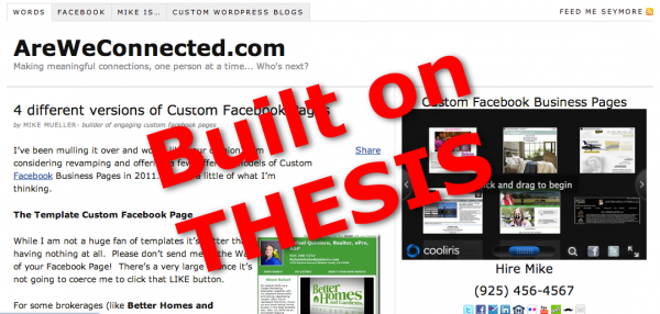
Not that you would know, but when I started this site (back in 2008) I used something called Thesis. It was a platform / theme that modified WordPress and for a long while it was pretty cool. For a while. But then, the owner of Thesis got into a rather ugly and public spat with the owner of WordPress and I started looking for a replacement.

I had been building sites in Genesis for a while. It was a strong platform. Heck, even Matt Cutts (from Google) switched from Thesis to Genesis so I went with theme I had been using the most of… Genesis and their theme, ‘AgentPress’.

I had built quite a few sites using the AgentPress theme. I knew the theme inside and out. I used the theme for non real estate sites like a Laundromat, a Winery, and a few Restaurants. I’d still be building with AgentPress today if it wasn’t for one thing…
MOBILE RESPONSIVE
Mobile Responsive is a somewhat new term being tossed about. What’s it mean? Why do we care? What’s so bad about a little pinch and grab?
Mobile Responsive means the site will try to adapt whatever smaller screen you happen to be using. We’re talking width here. If you want numbers, typically they look at 240px, 320px, 480px, 768px and up to 1024px wide. Your iPhone in a vertical postition is 240 px wide.
Admittedly, when it first came out I wasn’t all that impressed. Did we all need to jump on this latest bandwagon?

Then, Google came out and ‘suggested’ that they were going to penalize sites that weren’t mobile friendly. EEEEEK!
My site was built on AgentPress. The Genesis family has 100’s of themes to choose from but not all are Mobile Responsive. AgentPress is one of those NON Mobile Responsive themes. That was the catalyst for the change.
Now that I was looking at changing, I took some of my own advice. I wanted to maximize the things that were most important to me on the home page. That would be building new websites for clients, building new Facebook Apps for Clients, and building my newsletter list (an incubation system for any business).
I love the power of video so ‘above the fold’ you’ll see my Welcome Video. In 55 seconds it’ll tell everyone who visits who I am, what I do, and what I want them to do. Simple as that. The video resizes to fit the screen you are using maximizing the impact the video will have. This was not part of the responsive theme but a custom built feature I added.
Once past the Home Page the viewer will probably see a sidebar. I’ve got those same Calls to Action on the sidebar. Unfortunately, if you are anything smaller than an iPad in Landscape the sidebar needs to be dropped below the post for everything to fit. Like I said in the video – Responsive Design isn’t perfect but it is better than old style sites that required pinch and zoom.
Right about now you might be wondering (like I did) if Responsive Design is really all that important. As I was writing this post, my last post was just hitting the internet. I zipped over to my Google Analytics to see how it was being received. 11 Tweets, 11 LIKES on Facebook and so on…

Social Sharing drives traffic to my sites. It’s something I encourage. (have you +1’d this post yet?)
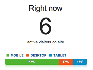
But the thing that caught my attention wasn’t the shares, it wasn’t the popularity (or lack of it). It was the devices people were using to read the post. Currently on my site 67% were mobile and add to that the 17% that were on a tablet of sorts. 84% of the people were using something that a Mobile Responsive site would be better for!
I know this was a small sample statistic, a moment in time. I decided to look deeper. Going back over the last month of visits softened those numbers a bit – but not by much…
In the end I bet I’ll see more clicks on my Calls to Action, more signups to my Newsletter, and more converted visitors to clients (isn’t that what we all want?). There’s also the Google aspect. By switching to Mobile Responsive I’ll stay high in the Search Engine Rankings for the keywords I want. Those that don’t have Mobile Responsive can play catch up later.
DO YOU NEED A MOBILE RESPONSIVE WEBSITE?
I’ll say YES. If you want to be found in Google. If you want to rank higher than your competition. If you want to give your viewers a better experience. If none of that matters to you – then just ignore this post, ignore your website and go along with your life not knowing what your missing. 😉
Want a Mobile Responsive Website? Here’s your LINK
- The Ultimate Guide to Writing the Perfect Blog Post - March 14, 2023
- 8 Questions Your Web Developer Should Have Asked - April 27, 2021
- Slack, Chat or Discord? - April 6, 2021
